Youth For Understanding USA
YFU USA
Role: UX/UI Designer
Problem: YFU was struggling year after year to find enough host families to host international students. Since YFU host families are volunteers, they have to really want the student they're hosting, so we needed to be able to essentially advertise potential exchange students to interested host families. Some want a student heavily involved in extracurricular activities like sports or band in order to fit their own family's lifestyle long-term, while others may prefer a short-term program placement.
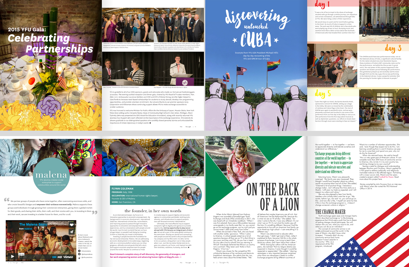
Other work for YFU USA included the alumni magazine The Light, promotional material for the annual gala, a tour poster for the first-of-its-kind Cuba tour partnered with the Gay Men's Chorus of Washington, fliers, educational handbooks, and more. One long-term project was designing and moving the website from an outdated WYSIWYG platform to Squarespace, viewable here.
SOLUTION
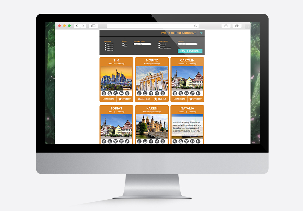
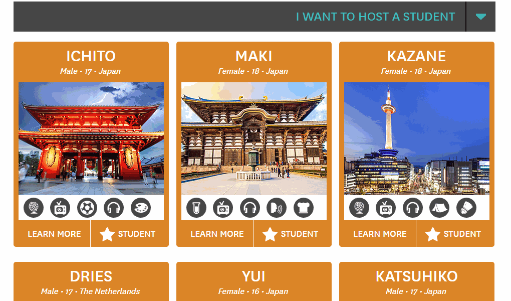
The solution was two-fold – there was a public-facing portion on the website and an internal portion within the company. The public-facing portion was a filterable list the showed all the students and the information that we were legally allowed to share with the public: first name, age, country of origin, interests, and a student-written letter to their future host family. The website also needed to allow potential families to express interest in students, so a “favorite” system was implemented and attached to the form submission.
The internal portion was managed by the other designer on staff who specialized more in print work. She created a series of designs for fliers generated by the staff intranet system, which could then be distributed by staff to potential host families in person. These fliers included multi-profile sheets and single student sheets, with varying levels of personal information for vetted and approved families. Both portions needed to respect various international laws for the amount of information that could legally be displayed.
PROCESS
The two halves were designed concurrently in order to make them feel like similar processes even though they would mostly be accessed by different audiences. I worked closely with the other designer, the IT team that would be implementing the generated fliers and integrating the website design with the student database, and the heads of marketing and host family placement. Together, we worked as a team to walk through the ideal experiences for each portion of the project.
We started with the general list of students and what information should be prioritized while factoring in what information could be displayed universally, and we ended up with name, gender, age, country, and up to five main interests.
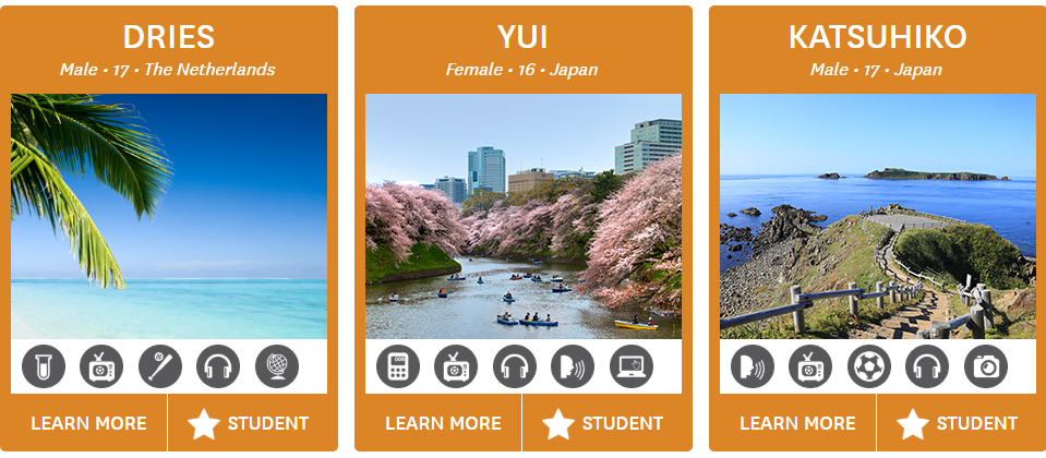
(Interests are selected by the student when applying and entered into the database – in order to keep the number of icons manageable, some interests were grouped into categories that could share icons.)
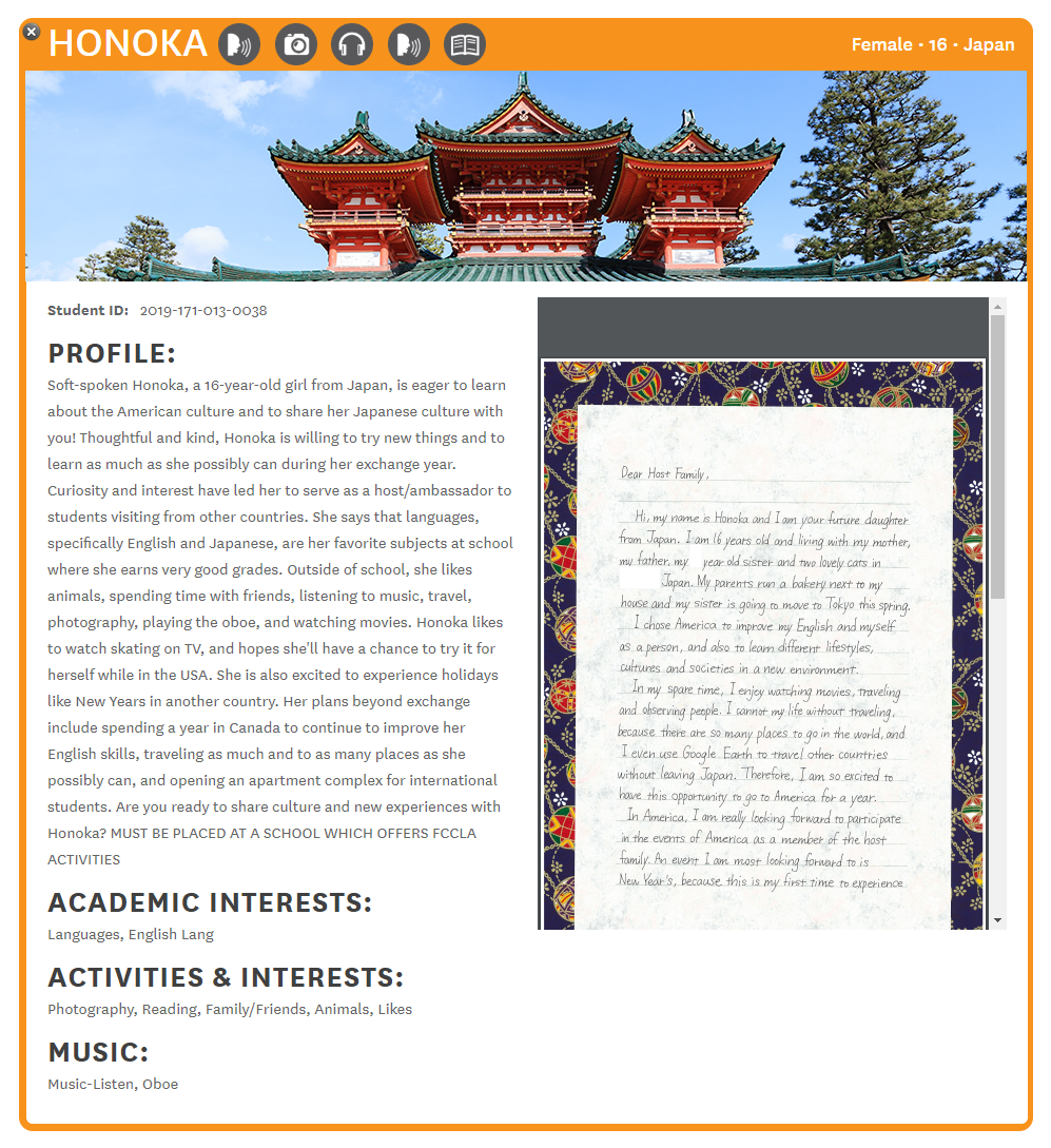
From there we created the individual student view, which would cover the display and expand on the information in the grid. This included written academic and extracurricular interests, a written profile, and most importantly, a PDF viewer to show the student's handwritten letter.
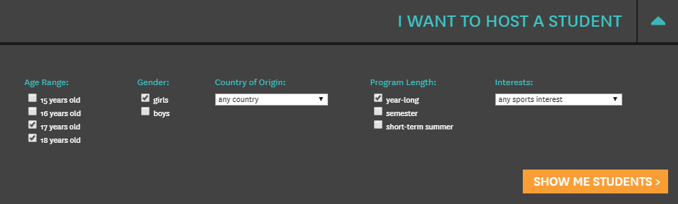
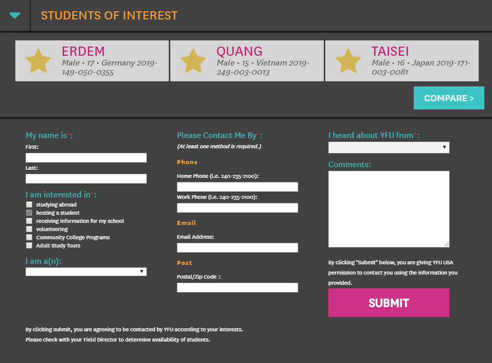
Once the student displays were settled, we moved on to enabling potential host families to easily sort through the students and express interest in ones that might fit well in their family. We gave them the ability to filter by all the criteria visible on the side – name, gender, age, etc, as well as length of exchange program in case families could only make specific time commitments. Finally, we gave host families the ability to star up to three students per page and directly express interest in those students through the contact form at the bottom. This was our standard contact form, but included the IDs of the students so that the appropriate host volunteer could contact and vet the family.
For each of these steps, a visual prototype was sketched, designed, and refined before moving on to development. Development was done in collaboration with the IT department – the framework, custom filter and contact forms, and asset creation was done before handing it over for full implementation with back-end variables. Finally, the system went through rigorous testing from all members of the team to catch any bugs still present, and then we were ready for launch.
The launch of the new Meet the Students system was a success both internally and externally. While I no longer have the exact numbers, there was an immediate uptick in potential host families contacting YFU through the Meet the Students page, and the system is still in use today.
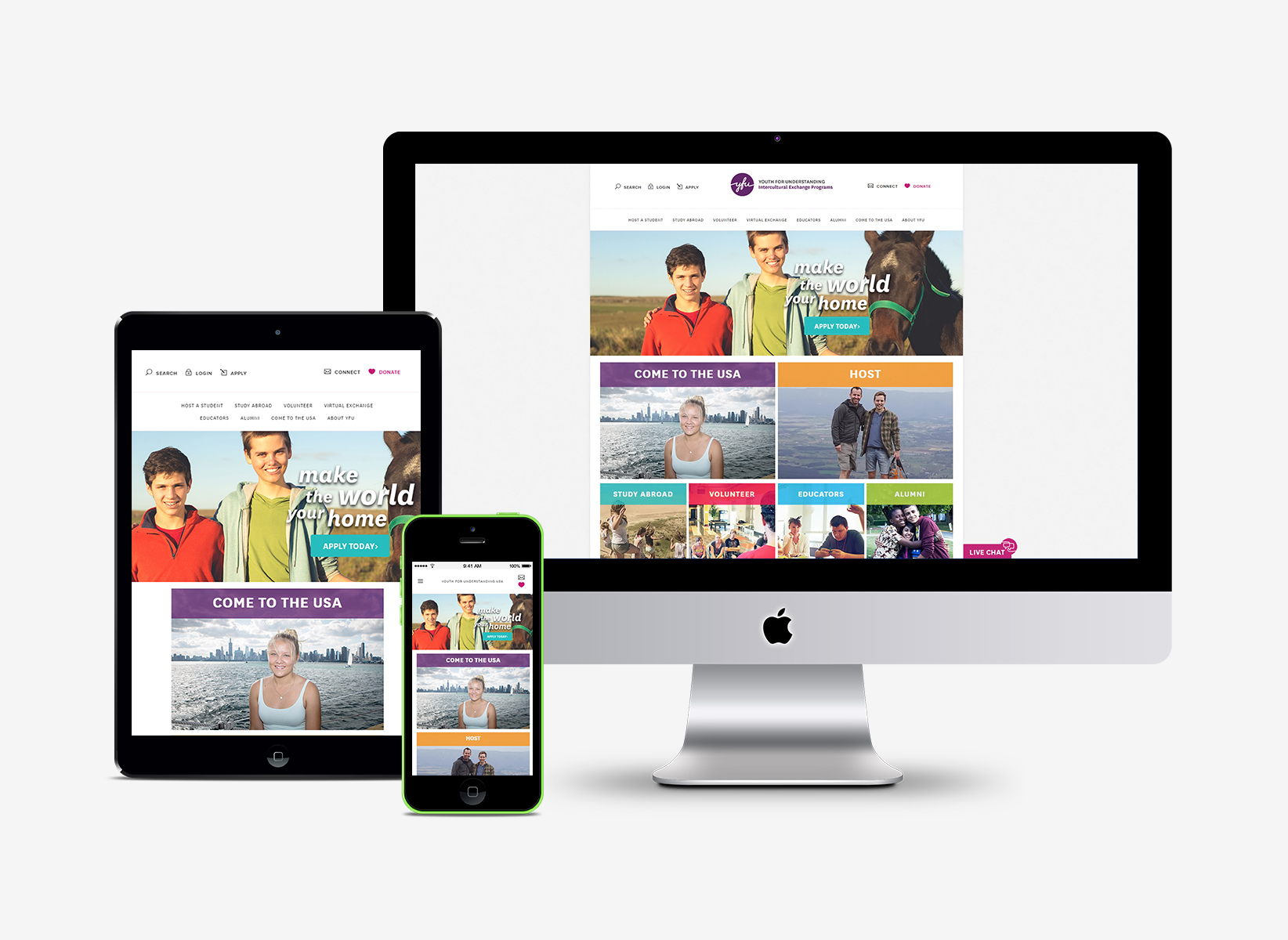
WEBSITE OVERHAUL
In late 2014, a team effort began to move the YFU USA website from its previous website CMS, an open-source system called WebsiteBaker, to Squarespace. I was in charge of designing the new responsive homepage experience as well as migrating a large portion of the content. I heavily modified a Squarespace template on the front and back ends in order to customize the site to suit YFU's needs. In addition, due to security needs for some of the exchange program and student content, I duplicated the modified template to an external secure site and ensured that the experiences matched as seamlessly as possible.
THE LIGHT: ALUMNI MAGAZINE
Launched by the head of alumni engagment during my time as an intern, The Light was a digital alumni magazine created to drive more alumni to stay involved with YFU. I was given full creative control over branding and design of the magazine. When the YFU global rebrand occurred, the magazine was updated and rebranded to match. Read the last issue of The Light.