Astra City
Dungeons & Dragons Campaign
Starstruck in Astra City, or Astra City for short, is a Dungeons & Dragons campaign set in an original world heavily inspired by Chinese culture.
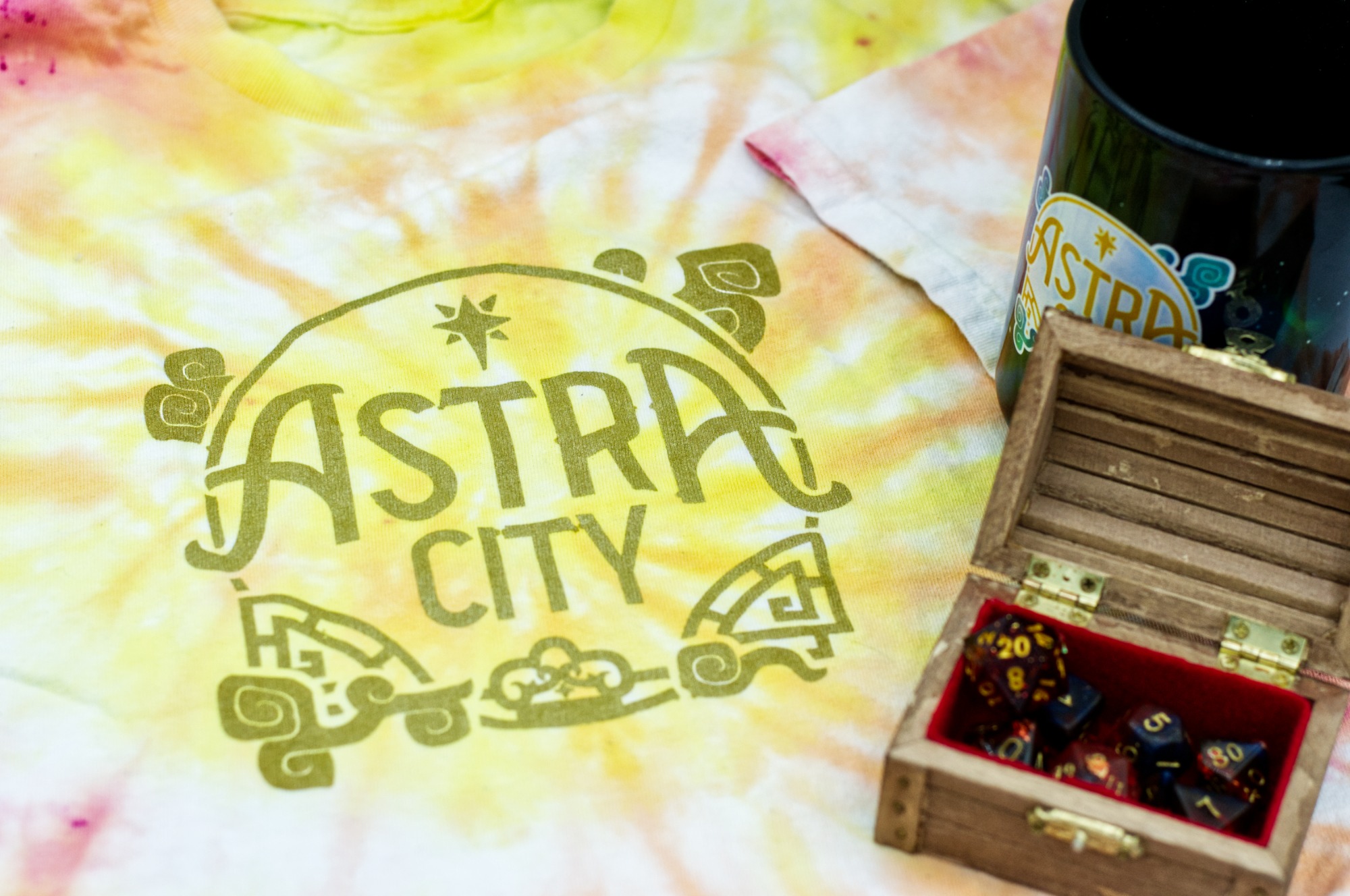
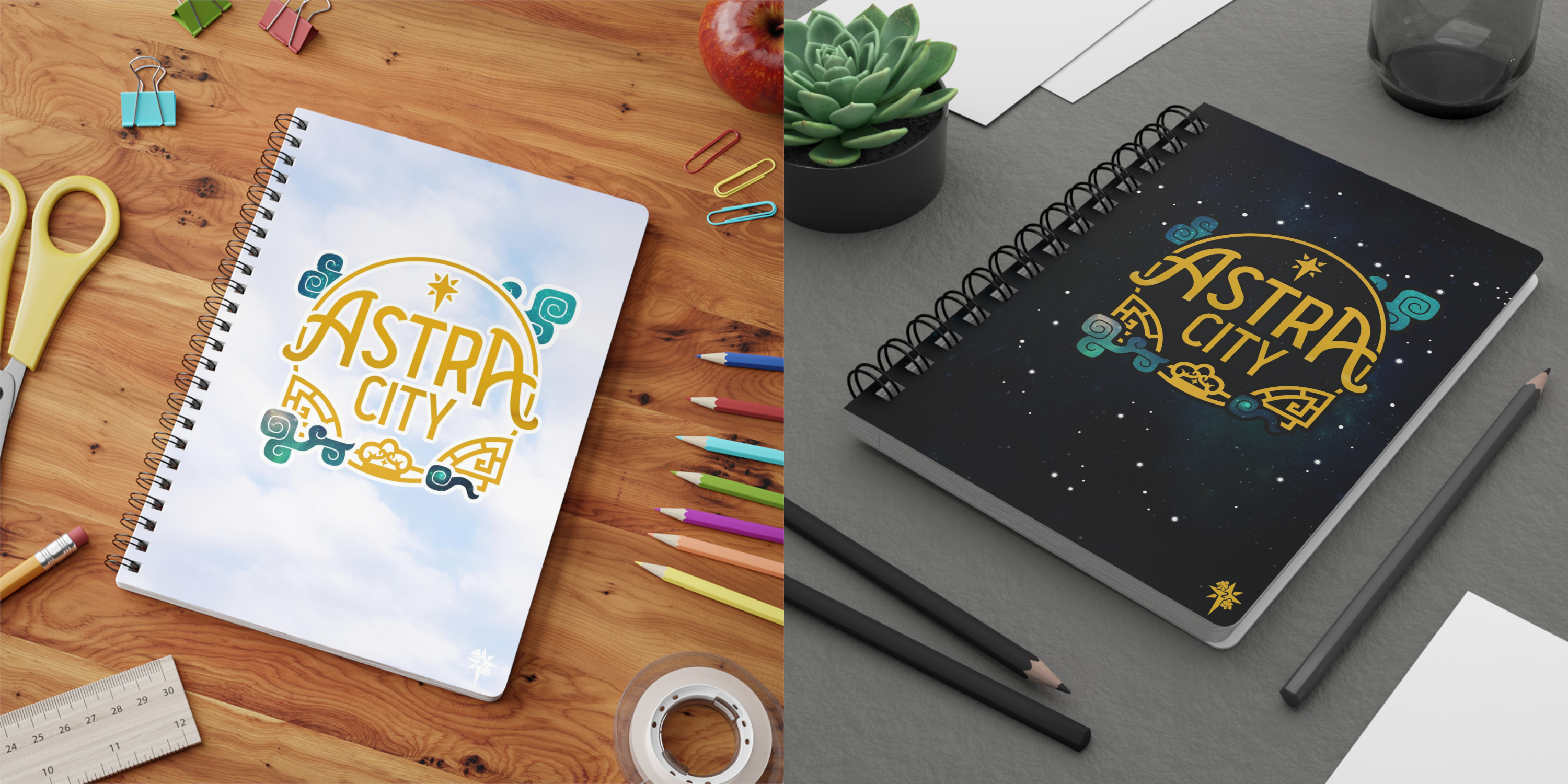
The campaign uses the logo on matching clothes, mugs, and notebooks used by the players and dungeon master.

PROCESS
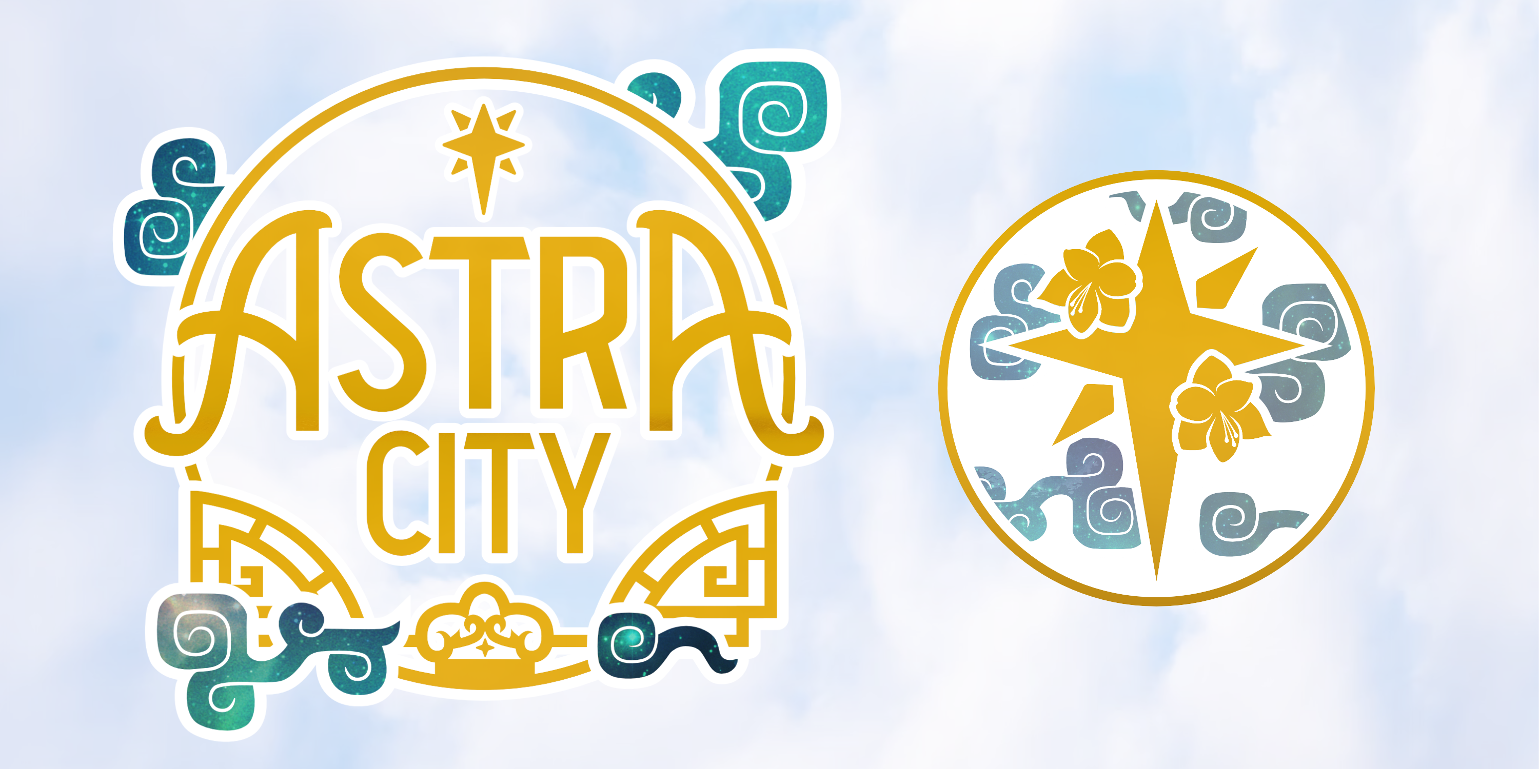
The campaign has two very different visual aesthetics, traditional Chinese art and architecture, and vibrant 80s neon. The first version of the Astra City logo focused on the 80s neon aspect, so when designing a new version for the second anniversary, I focused on the traditional Chinese architecture aspect.
When starting the new design, I began with the existing type, but quickly realized it didn't fit the shape or the energy of the new frame, so I started from scratch.
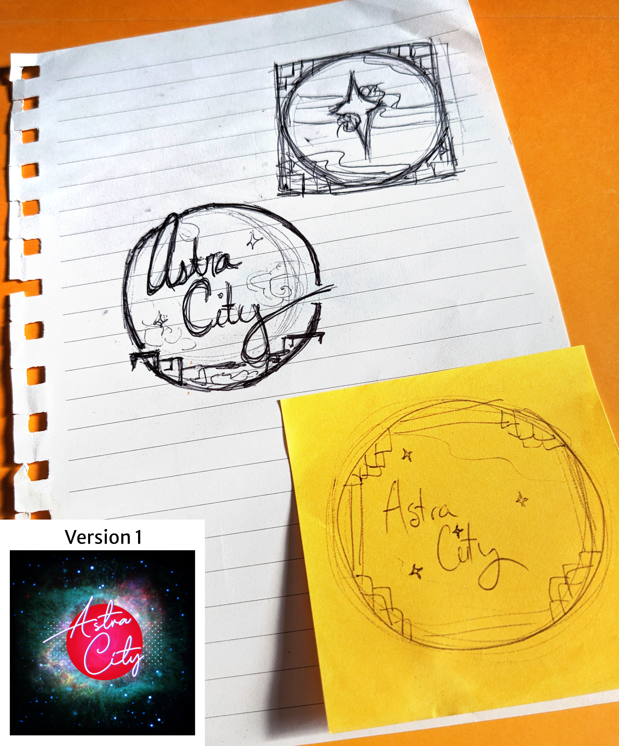
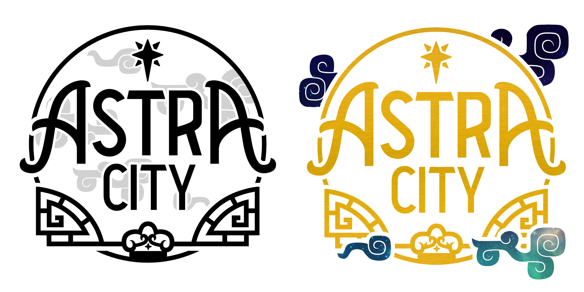
I took heavy inspiration from Chinese window and doorframes when creating the shapes of the frame, taking care to give enough weight on the bottom to offset the weight of the type. True to the name, Astra City as a story and world places heavy emphasis on the stars and celestial bodies, so it was important to incorporate some of that. Clouds represent the heavens in Chinese culture, so in addition to stars at the top and bottom, I experimented with a few ways to work clouds into the design.
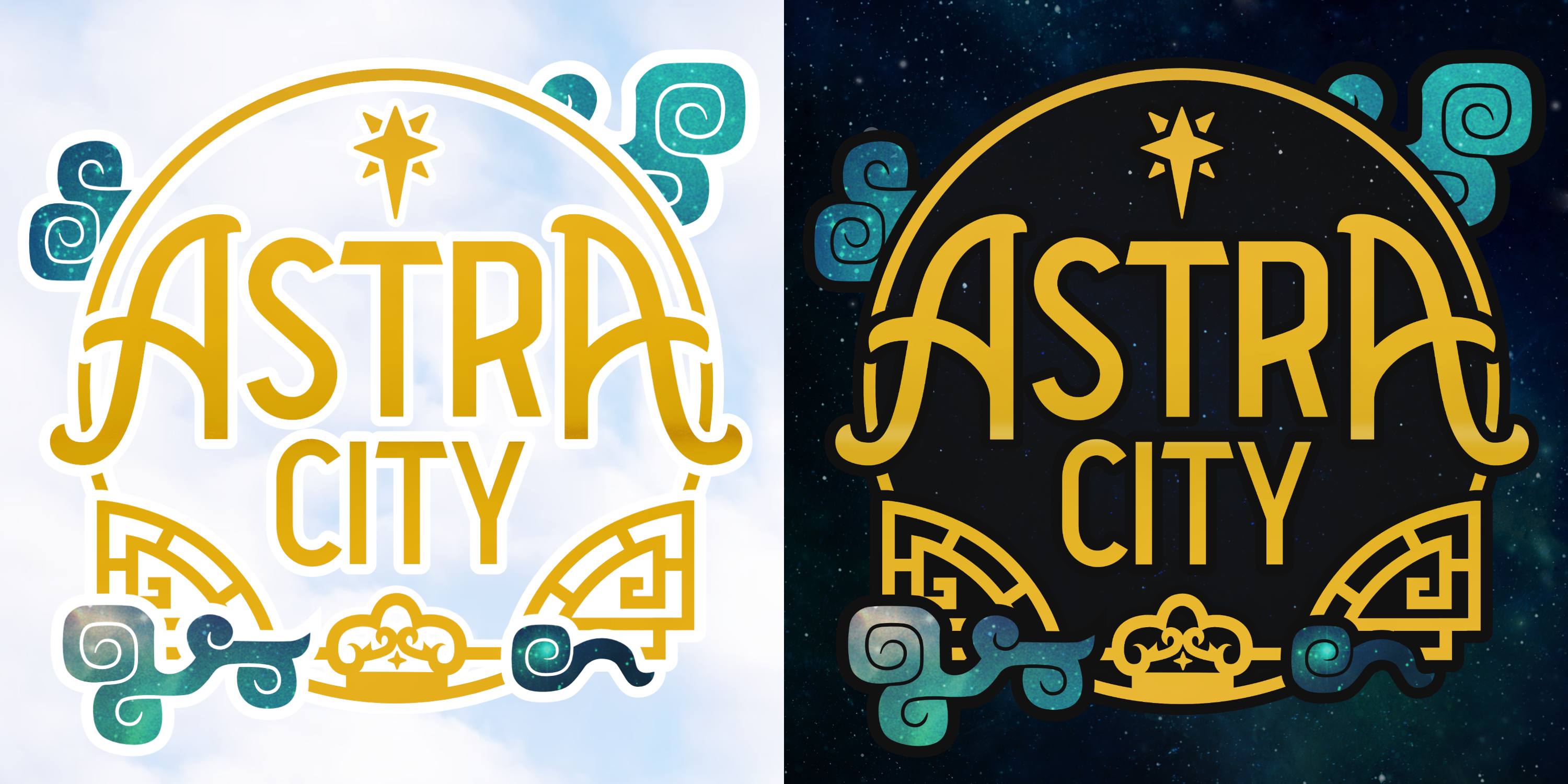
The final result featured the clouds on the outside of the frame and a subtle metallic effect on the gold, and although unintentional, it feels like the title card to an animated show. I created both day and night versions, both for use on light and dark backgrounds and to reflect different aspects of the world and story.
![]()
In addition to the full title, I also created a smaller icon, drawing inspiration from the royal family of world of Astra City. This was made alongside the first logo, and then refined and given a frame to match the updated versions. On the smaller version, the clouds actually worked inside the frame, giving depth to the icon.